Elapse App Design
After four years competing in VEX Robotics, I knew how much attention tournament logistics could take away from the competition itself. I designed Elapse to put a team's next match, tournament information, and scouting tools within easy reach.
Vex Robotics Competition
UI/UX DESIGN
2023
DOWNLOAD NOW ↗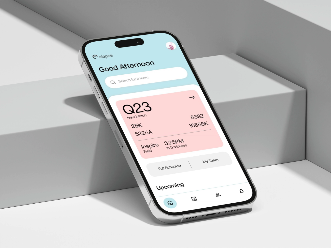
Helping robotics teams move from checking the schedule to preparing for their next match.
- Role
- Co-founder / Product Designer
- Timeline
- November 2022–January 2025
- Activity
- VEX Robotics Competition
- App Status
- Released on iOS and Android
- Key Features
- Schedules, rankings & scouting
- UI Design
- Figma
Overview
Elapse is a tournament companion for VEX Robotics competitors. As co-founder and product designer, I shaped the interface around the decisions teams make throughout an event: when to head to the field, who they are playing with, and which teams to scout. The design grew from a personalized schedule into a broader mobile experience with rankings and ScoutSheets.
Impact
Released on iOS and Android; reached 3,500+ users globally.
Context
Built from the competition floor
A robotics tournament asks teams to manage a lot at once: prepare the robot, find alliance partners, scout other teams, and arrive at the right field on time. During my four years competing, I experienced how delays and missed announcements could make that harder. Checking the schedule was another interruption when useful information was spread across multiple screens.
The original concept focused on three problems: finding key tournament information, understanding schedule changes, and receiving announcements. I proposed a personalized home screen, live timing, and an announcement feed with organizer controls. These ideas established the direction for Elapse; the released mobile app now centres on tournament mode, upcoming matches, and team scouting.
Structure
Start with the team, then connect the information
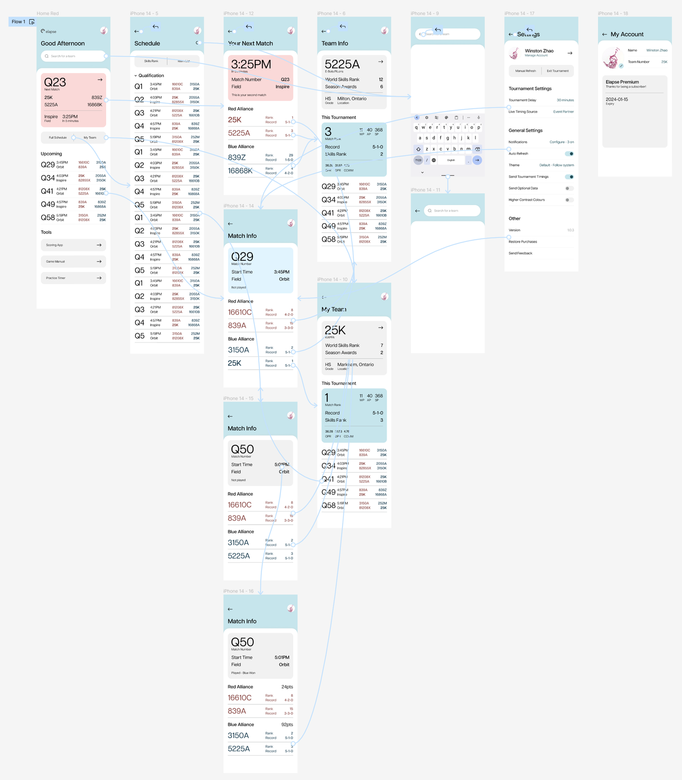
I organized the experience around a team's tournament day. The home screen surfaces the next match and upcoming schedule, with tournament search close by. From a match, a competitor can move into an alliance team's profile, see its ranking and record, and return to that team's matches. The flow map connects these routes so a schedule entry becomes a starting point for preparation.
Later designs extend that structure with dedicated tournament, scouting, and explore areas. Onboarding asks for a team number to personalize the experience and offers an option to continue without an account. Account creation is introduced alongside CloudScout, where syncing and sharing give competitors a concrete reason to sign in.
Tournament day
Make the next match the first thing to see
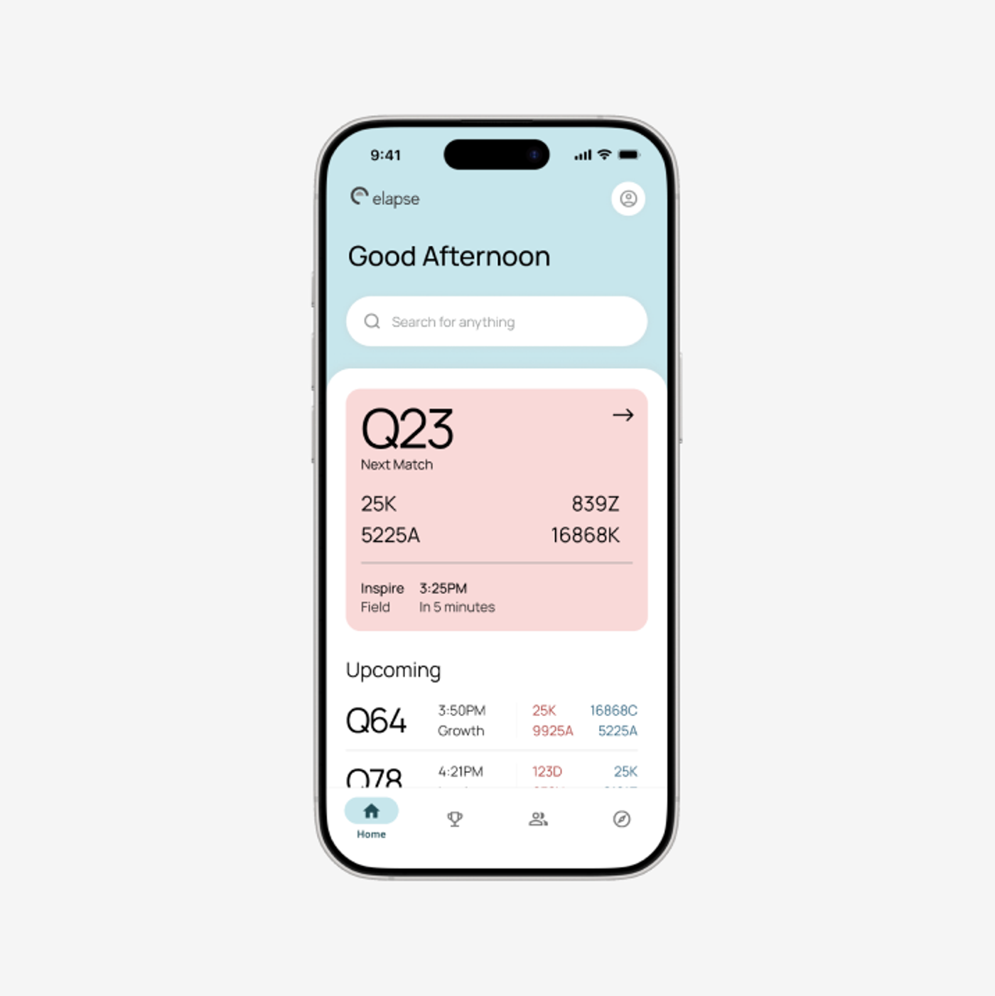
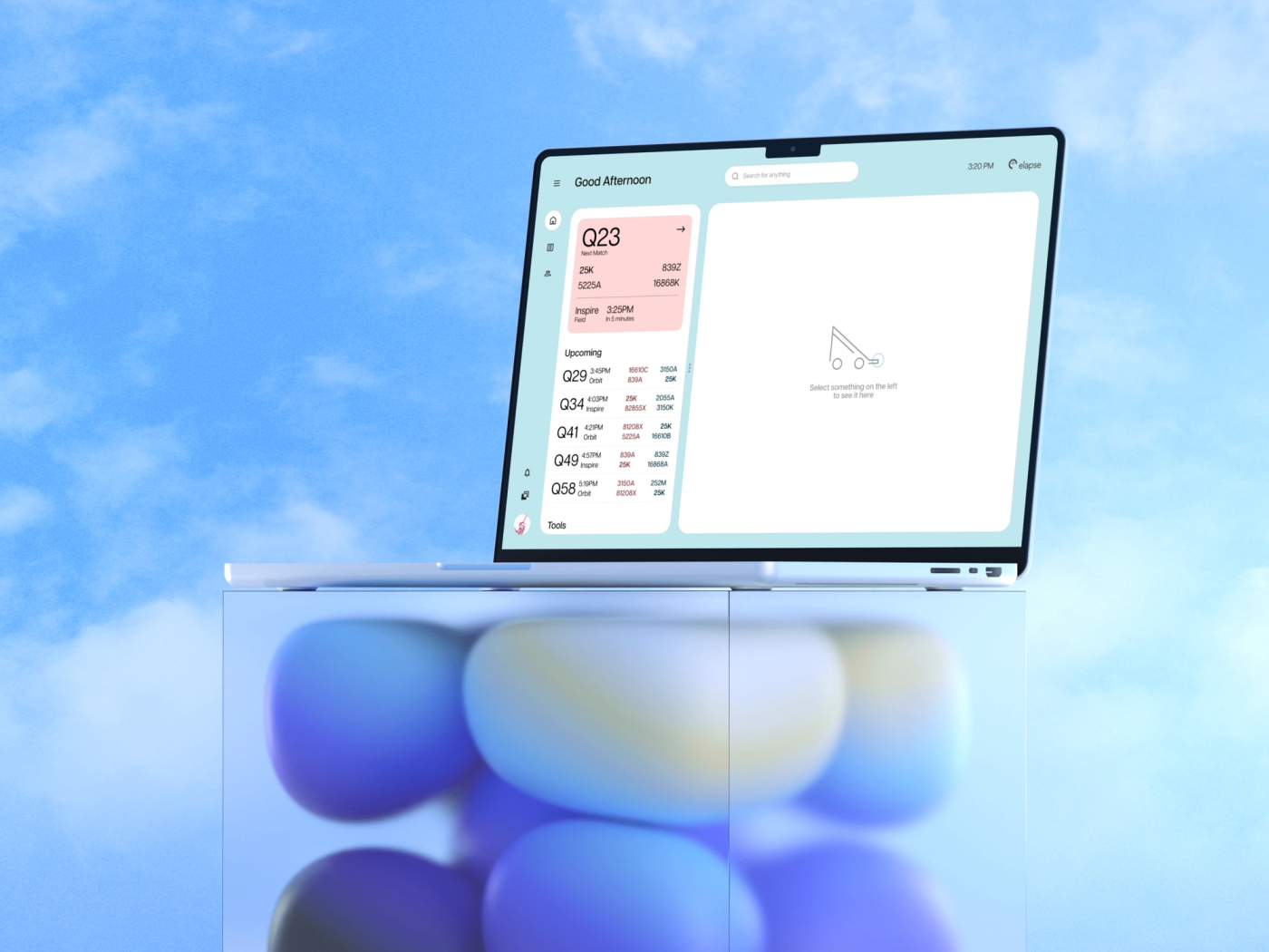
The next-match card gives the most immediate decision the strongest hierarchy. A large match number sits above the alliance teams, field, and start time. The upcoming list remains below it, so competitors can see what comes after without opening the full schedule. Search and the team's tournament context stay available around that priority.
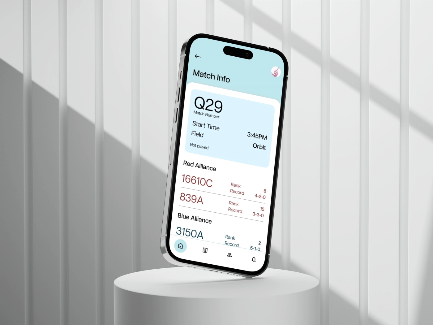
Match details bring the number, time, field, and alliance information together. The Figma work includes separate states for upcoming and completed matches, a team's own matches, and live timing. In the live-timing design, a delay is shown alongside the original time. That makes the schedule change explicit while retaining the reference a competitor may already know.
Scouting
Carry team knowledge through the tournament
Scouting expands Elapse beyond checking when to play. The CloudScout designs separate ScoutSheets from a personal picklist, giving teams a place to record observations and organize potential alliance partners. A team profile includes robot specifications, photos, scouted matches, and notes. Those fields connect the statistics a competitor can read to the observations they make at the event.
I also explored collaboration through TeamSync: shared scout data, group join codes, and member roles. The sharing designs make access visible, with controls to copy a link or stop sharing. TeamSync and the organizer portal remained concepts, while ScoutSheets became part of the released mobile app.
Visual system
A calm frame for dense tournament data
The interface uses a pale cyan frame, white content cards, and a pink highlight for the next match. Large match and team numbers anchor screens that contain many smaller statistics. Red and blue alliance colours reinforce the grouping already named in the headings. Consistent rows keep ranks, records, and points aligned as competitors compare teams.
The design file also covers light, dark, and system-following themes, onboarding choices, filters, and account settings. The original desktop concept carries the same hierarchy into a two-panel layout: the schedule stays on the left while selected information opens on the right. It documents the broader design direction, alongside the mobile screens that became the app.
Release
From a tournament idea to a released app
Elapse launched on iOS in November 2024 and is also available on Android. The released app includes tournament mode, upcoming matches, and ScoutSheets. As co-founder and product designer, I led a team of eight through design and development. Elapse reached 3,500+ users globally.
This project brought together my experience as a competitor and my work as a designer. I wanted the app to stay useful in the rush of an event, so the next match remained the anchor as scouting and ranking tools expanded the scope. The early desktop, organizer, and sharing concepts remain part of the design exploration shown here.