Hopper Hangout
At Alicehacks 2023, I led the design of Hopper Hangout with three friends. We created a mobile app concept that helps teens plan activities around the interests of their whole group, combining playful custom graphics with a connected Figma prototype.
Alicehacks 2023
UI/UX DESIGN
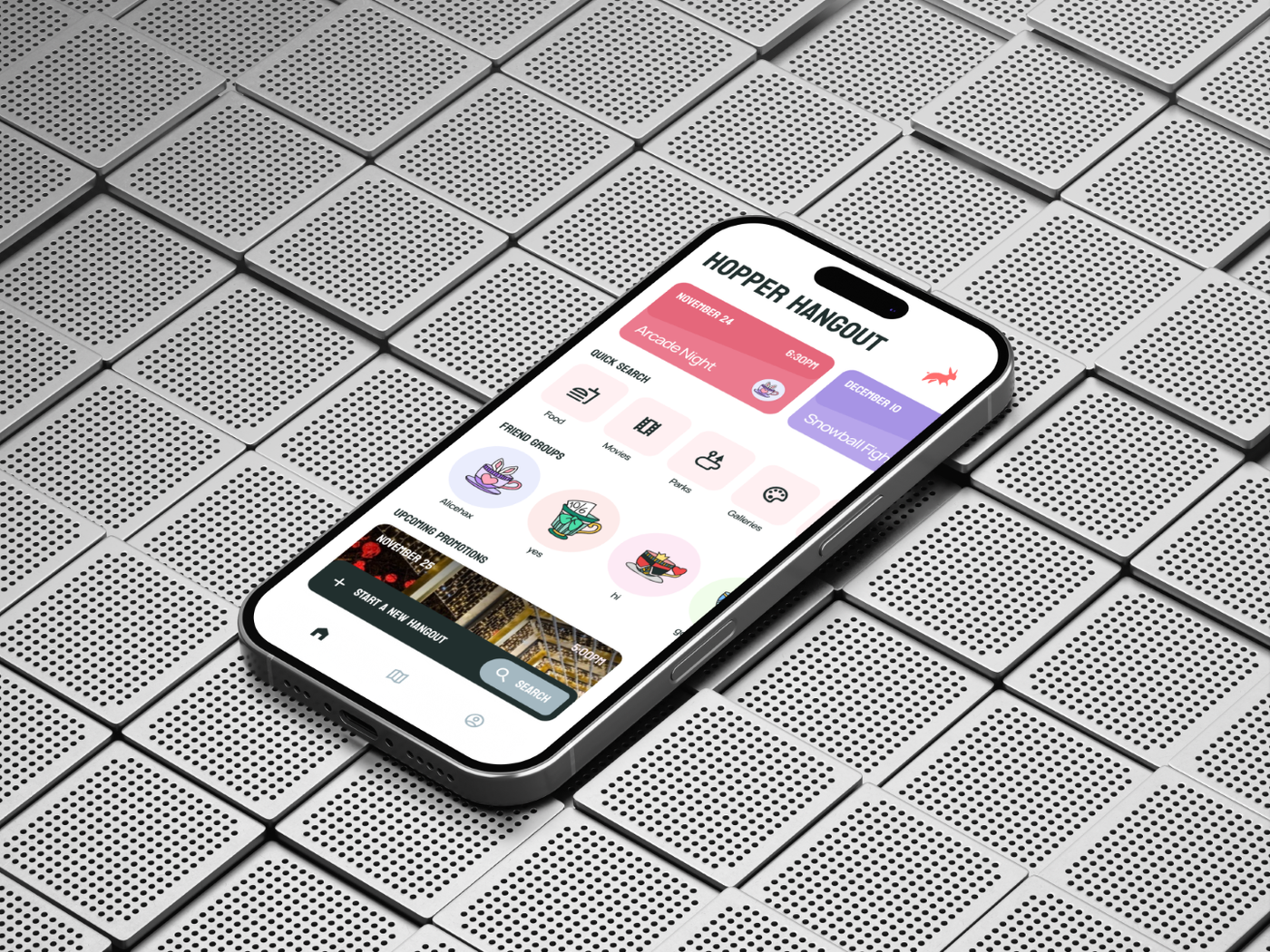
From individual tastes to a shared itinerary: a playful way to make plans with friends.
- Role
- Lead Designer
- Timeline
- November 2023 · Alicehacks
- Team
- Andrew Chu, Anita Du, Laison Tao
- Tools
- Figma, FigJam, paper sketches
- Recognition
- Best Design Hack · Alicehacks 2023
Overview
The idea came from our own experience of trying to organize a day out. Food preferences, travel distance, and different interests could turn a simple meetup into a long discussion. Hopper Hangout explores how a mobile product could bring those inputs together, suggest places for a friend group, and organize them into a plan that everyone can review.
Impact
Winner, Best Design Hack at Alicehacks 2023.
Challenge
Make a plan that considers everyone
Planning a hangout involves more than finding an interesting destination. One friend may dislike a cuisine, another may prefer a shorter trip, and the group still needs to agree on an activity and a time. We wanted to help teens move through those decisions without losing sight of each person’s preferences.
Our concept treats a friend group as the starting point for recommendations. Members contribute their tastes, then use those shared inputs to create a hangout made up of individual stops, or “hops.” The goal was to turn a vague idea for a meetup into a specific itinerary the group could understand and confirm.
Alicehacks was my second hackathon. Working with Anita, Laison, and Andrew, we chose a design-only submission and focused our time on the product experience, visual identity, and an interactive prototype.
Process
Sketch the experience before polishing the interface
We began by discussing our own planning frustrations in a shared document. Once we chose the hangout concept, we used FigJam to map user needs and the features required to support them. A task board helped us divide responsibilities while keeping a shared view of the product.
I sketched preliminary layouts and interface elements on paper before moving into Figma. This made it quick to explore alternatives and communicate ideas. Under the hackathon time constraint, we moved from those early sketches into high-fidelity screens, building components for buttons, cards, switches, and recurring navigation patterns.
We also considered how the proposed recommendation system and business model would affect the experience. Featured business and event listings were one possible revenue source, with sponsorship influencing placement among options that already matched the group. That was a product proposal for future development; our submission demonstrated the experience through a Figma prototype.
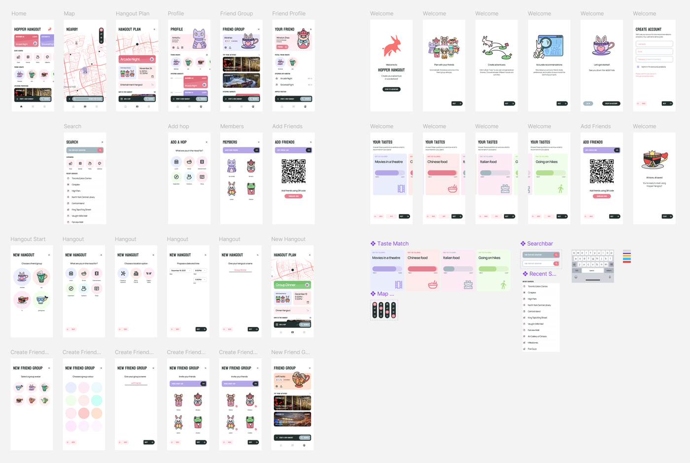
Visual identity
Give the product a playful, recognizable personality
We wanted the app to feel inviting to a teenage audience while keeping practical information easy to read. The brand combines a dark gray foundation with turquoise and secondary red, purple, and green accents. Lighter surfaces give cards and illustrations space, while stronger colours help distinguish groups and activities.
Koulen gives headings a bold, compact shape. Manrope handles smaller labels and body text. This division lets the product keep its character in titles without carrying the same visual weight into every detail.
The Alice in Wonderland theme of the hackathon became part of the product identity. Our team drew characters and objects for onboarding, personal avatars, and friend-group icons. Reusing those illustrations across the app gave familiar people and groups a recognizable presence in the planning experience.
Onboarding
Make preferences a clear input to the plan
Onboarding introduces three ideas: planning with friends, building adventures with multiple hops, and receiving recommendations based on tastes and location. Those short explanations establish why the app asks for personal preferences before the user reaches the main experience.
The taste questions use concrete examples such as movies in a theatre, Chinese food, Italian food, and hiking. Each card presents a slider from “Hate it” to “Love it,” allowing a preference to have a degree rather than a simple yes-or-no answer. A single card stays prominent while the surrounding cards suggest that the questions continue.
Back, Skip, and Next remain visible at the bottom of the flow. The interface tells users that these answers inform their plans, and the completion screen gives the setup process a definite end before they enter the app.
Planning
Build an itinerary through small decisions
Creating a hangout starts with a friend group. The flow then asks what the group is in the mood for, with choices including lunch, dinner, entertainment, exploration, outdoors, and study. Location options express different constraints: closest to everyone, within the city, or unrestricted.
Date and start/end time receive their own step, followed by naming the plan. Separating these decisions keeps each screen focused. A group can provide the context for recommendations without filling out one dense form.
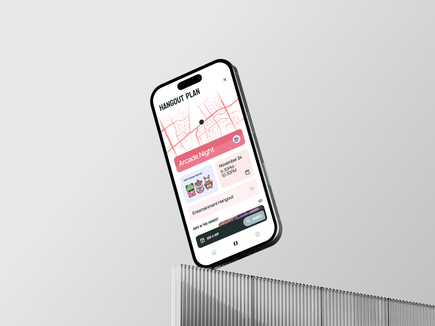
The resulting Hangout Plan brings the map, group members, activity type, and timing together. Individual hops show their location and scheduled time, with an Add a Hop action for extending the itinerary. The new-plan state also displays a confirmation count, making group agreement visible as part of the plan.
Navigation
Separate where you go from what you do
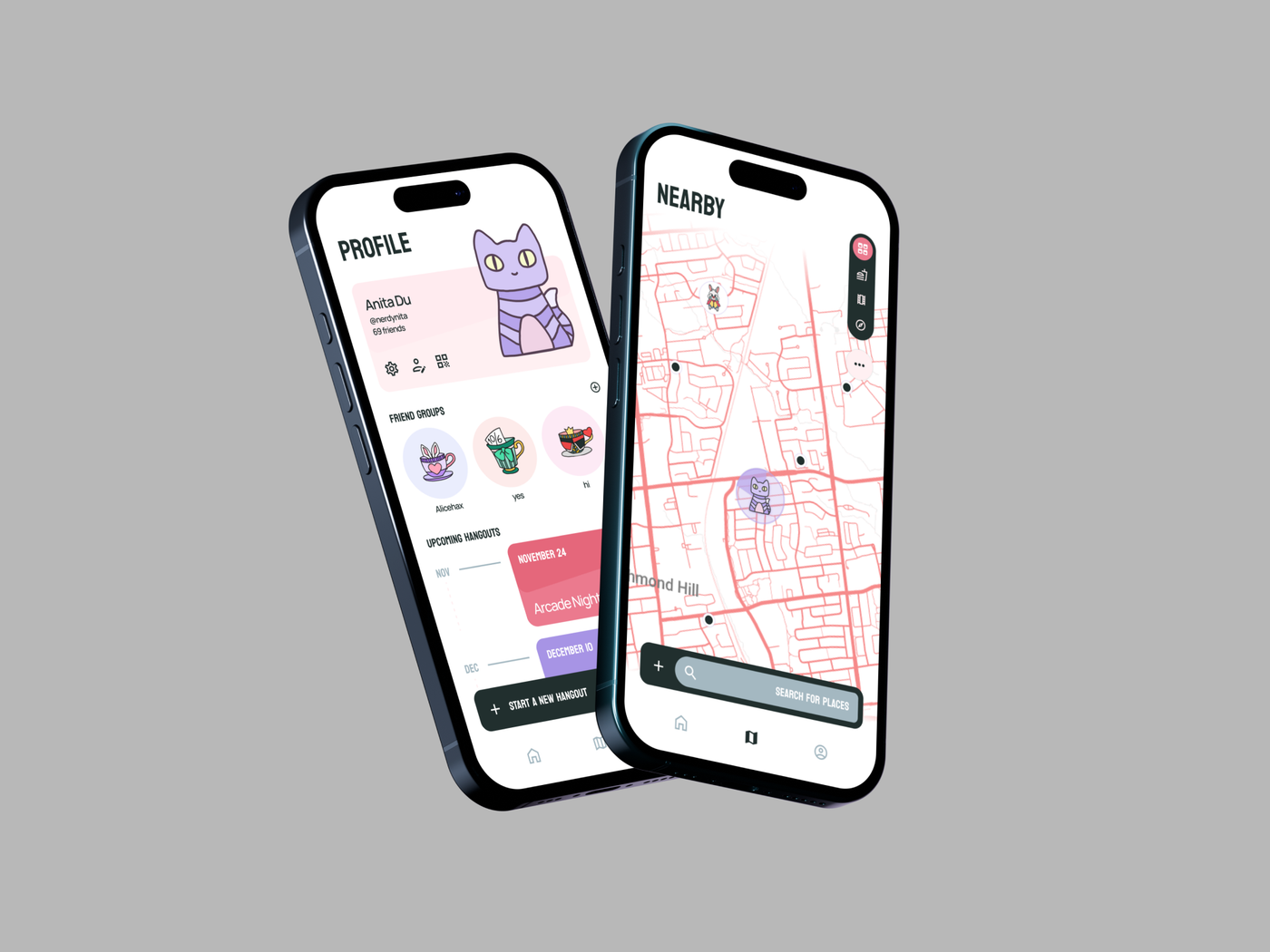
The main navigation uses three tabs: Home, Map, and Profile. Home collects upcoming hangouts, quick activity categories, friend groups, and promoted events. Map supports browsing places spatially, while Profile organizes personal information, friend groups, and past and upcoming plans.
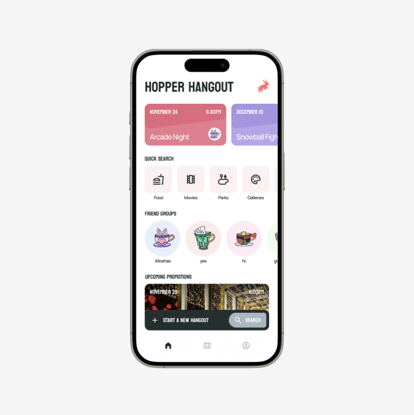
A floating action bar sits above the tab navigation and adapts to the current task. Home gives Start a New Hangout the larger labelled action. Map gives more room to Search for Places. Within a plan, Add a Hop becomes the prominent action. A smaller companion control keeps the secondary action available without adding another full row of buttons.
This distinction was central to the interface: the tabs answer where to go, and the action bar answers what to do next. Friend groups follow the same approach, pairing upcoming plans and suggested activities with a direct way to start a new hangout. Profile-link and QR-code screens provide concrete ways to add friends.
Outcome
A complete prototype and a Best Design award
We linked the screens into an interactive Figma prototype and added transitions between parts of the journey. Andrew created a state diagram to communicate how the features connected. For the final submission, we prepared a narrated presentation with Anita and demonstration videos that showed the main flows.
Hopper Hangout won Best Design Hack at Alicehacks 2023. The result was a connected design concept spanning onboarding, local discovery, group management, and itinerary creation, supported by a consistent visual system and custom illustrations.
My main takeaway was the value of making the experience clear early. Shared planning, paper sketches, and reusable components helped us work quickly without losing consistency across screens. The next step for a product like this would be to test the planning flow with real groups and build the recommendation logic; the prototype established a concrete experience to evaluate.