YRConnect
Booking a study room or a court should not require learning a different website each time. At YRHacks 2024, Aubree and I designed YRConnect to bring everyday York Region services into one mobile experience.
YR Hacks 2024
UI/UX DESIGN
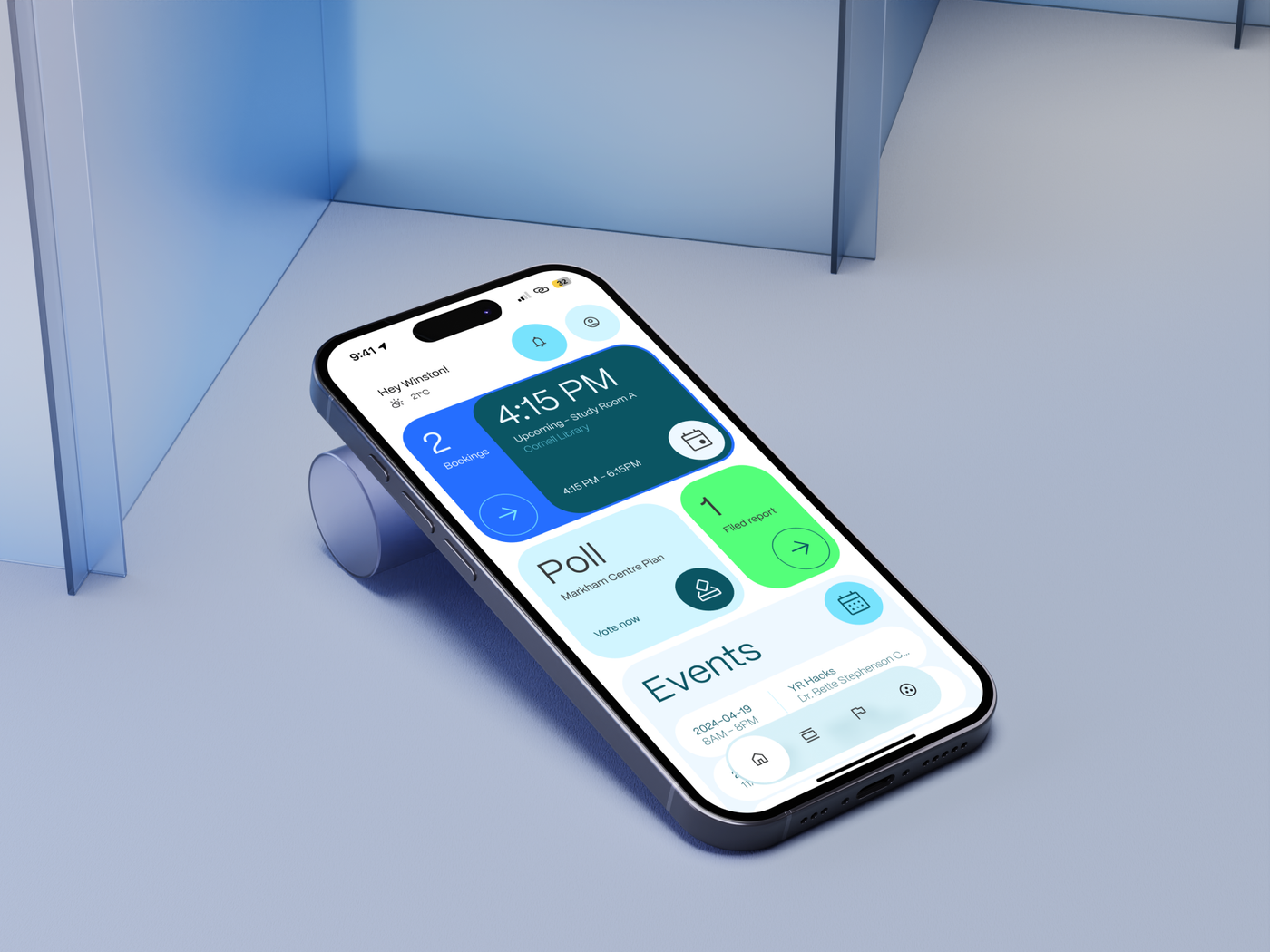
YRConnect brings facility bookings, service requests, and community participation into a shared resident app. I led the interface and design system for the Figma prototype, which won Second Place at YRHacks 2024.
- Role
- Lead Designer
- Team
- Aubree Lianto
- Timeline
- April 17–18, 2024
- Tools
- Figma
- Deliverable
- Mobile app concept / Interactive prototype
- Recognition
- Second Place, YRHacks 2024
Overview
YRConnect is a mobile app concept for York Region residents. It connects study-room and sports bookings with municipal service requests, local notices, events, and polls. Working with Aubree across the two-day hackathon, I designed a consistent set of mobile flows and an interactive prototype that made the idea tangible for the judges.
Impact
YR Hacks 2024 — 2nd Place
Challenge
Bring fragmented services into one place
The idea came from a familiar frustration. Aubree and I wanted to meet for volleyball games and study sessions, but booking a court or a room at Cornell Library meant navigating a series of pages and forms. Municipal and regional services were spread across different URLs, tabs, and interfaces. We saw an opportunity to give residents one place to find a service and follow through on it.
YRHacks was my third hackathon, and we chose to submit a design project. The event started online and continued in person the following day, so we needed a clear scope we could turn into a convincing prototype. We focused on facility bookings, service requests, and community updates: three everyday needs that could share a resident account and a familiar navigation structure.
The audience extended beyond students like us. We wanted the concept to be readable for residents of different ages, with visible actions and clear information hierarchy. That goal shaped the interface from the first sketches through the final screens.
Process
Establish the system before building the flows
We began with a feature list and divided the work around what each of us felt comfortable designing. I worked on the interface and design system, while Aubree contributed to onboarding and the pitch. Paper sketches let us explore the dashboard quickly before refining spacing and individual elements in Figma. The key question was how to fit varied information on home without turning it into a dense menu.
Different coloured cards became the organizing device. Blue connected the visual direction to York Region, while light green, pale cyan, and darker teal gave us ways to separate content and create emphasis. We paired that palette with the Mori typeface from Pangram Pangram. Bold labels, generous type sizes, and distinct surfaces supported our aim to make different kinds of content readable at a glance.
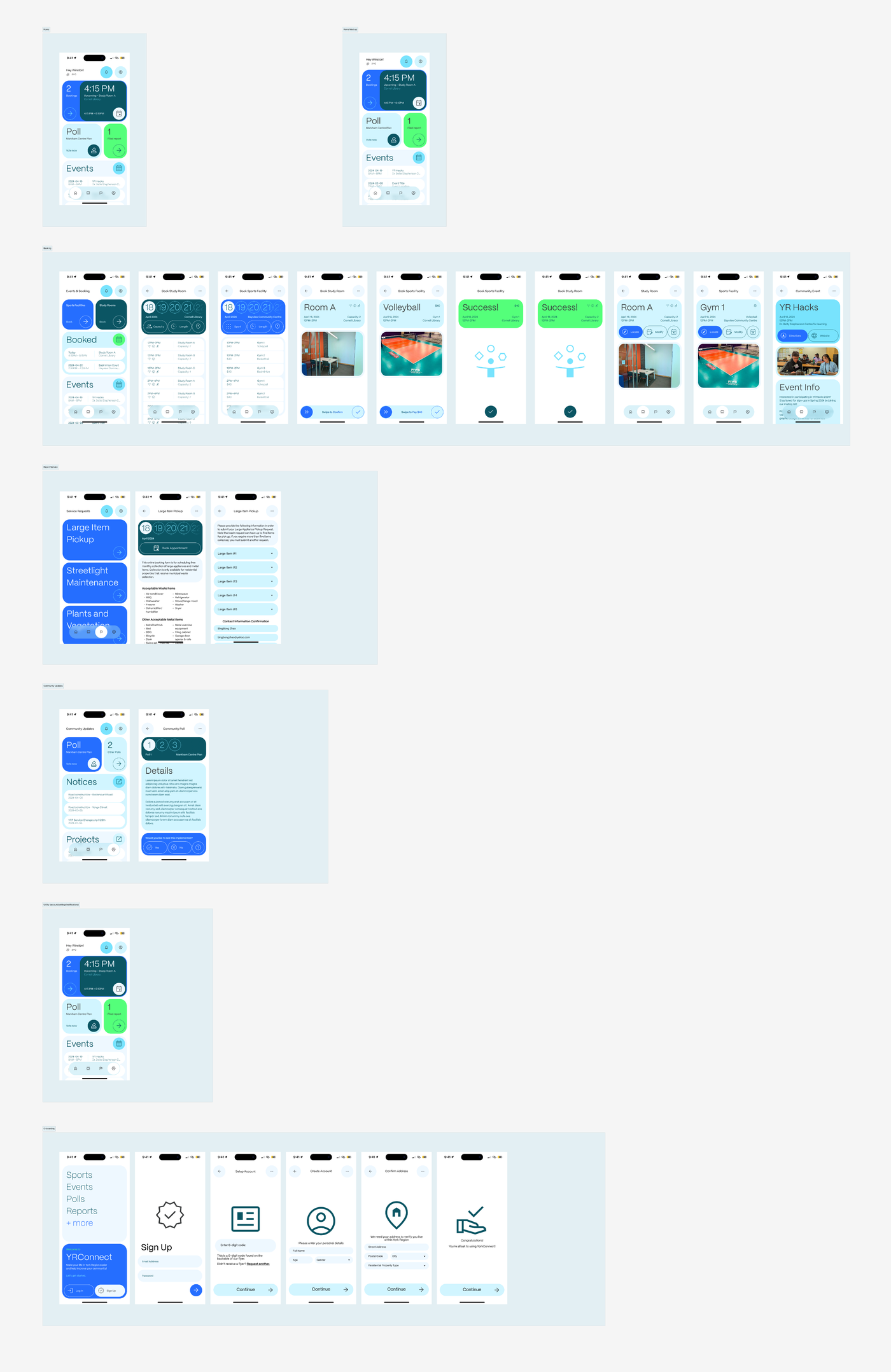
Reusable headers and bottom navigation kept the growing set of screens consistent. Figma components let us carry those decisions between frames, and auto-layout helped organize the dashboard grid. We then connected account setup, bookings, requests, and community screens into a prototype so the proposal could be experienced as a set of related tasks.
Dashboard
Put the next commitment first
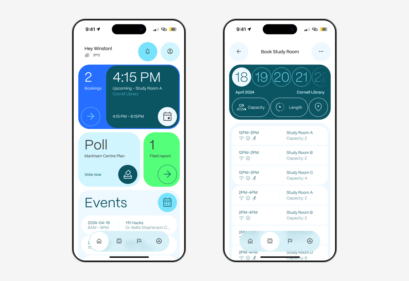
Home combines a personal greeting with cards for bookings, a community poll, filed reports, and events. The next reservation gets the strongest hierarchy: its time is large, with the room, library, and duration grouped below. A resident can see an upcoming commitment immediately and move into the booking area from the same card.
The other cards keep community activity visible around that priority. The poll includes a direct voting prompt, the report card summarizes an existing request, and the event list pairs dates with names and locations. Colour and scale give each type of information its own place without asking residents to scan a long list of equal-weight options.
A persistent bottom navigation connects the main areas. The same rounded surfaces and circular controls recur across the screens, giving booking, reporting, and participation a shared visual language even when their content differs.
Bookings
Compare the options, then review the commitment
The booking area separates sports facilities from study rooms and keeps existing reservations alongside upcoming events. This makes it useful both for starting a new booking and checking plans already made. From there, the availability screens put the date, facility, and relevant filters above the results.
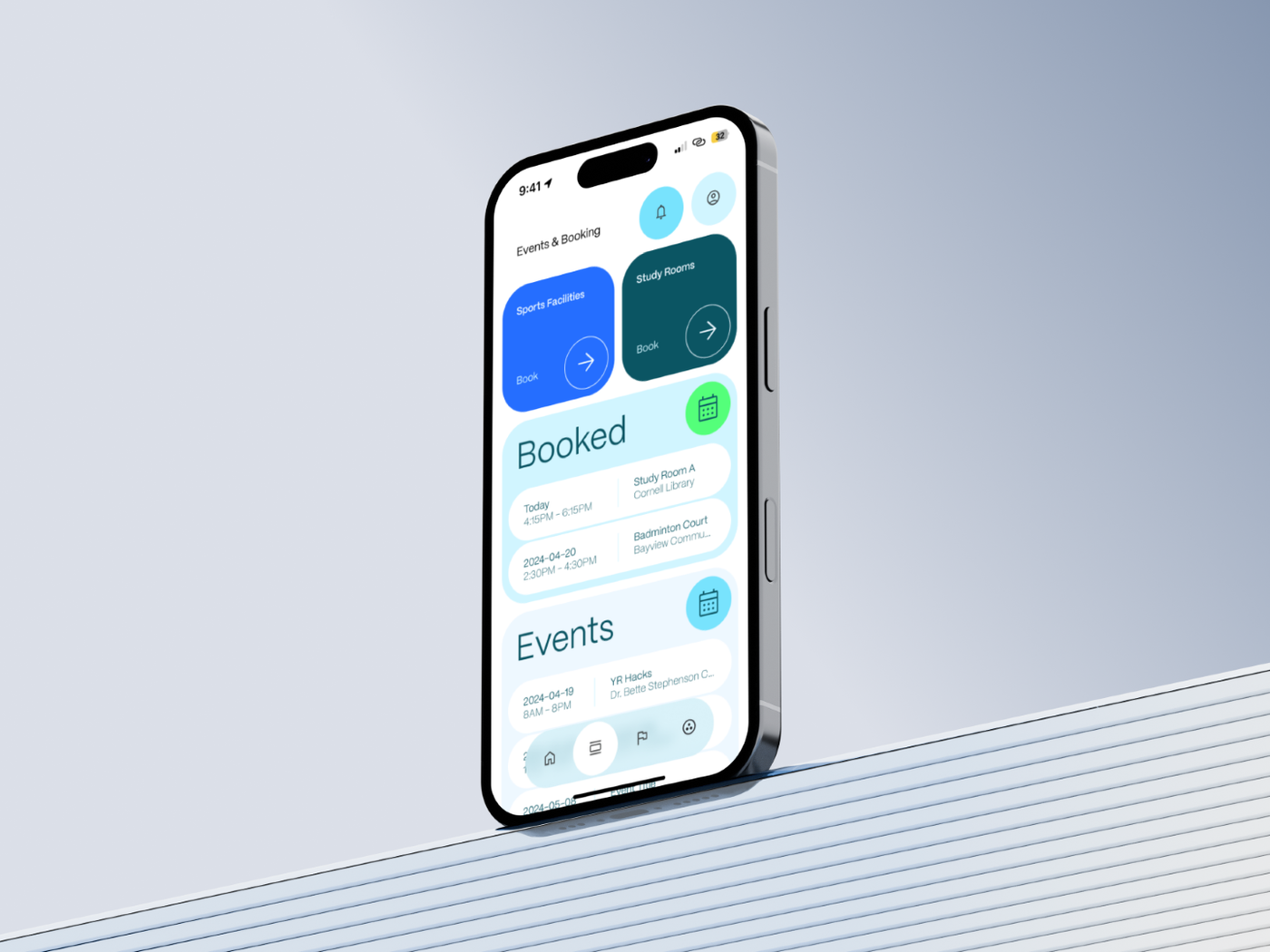
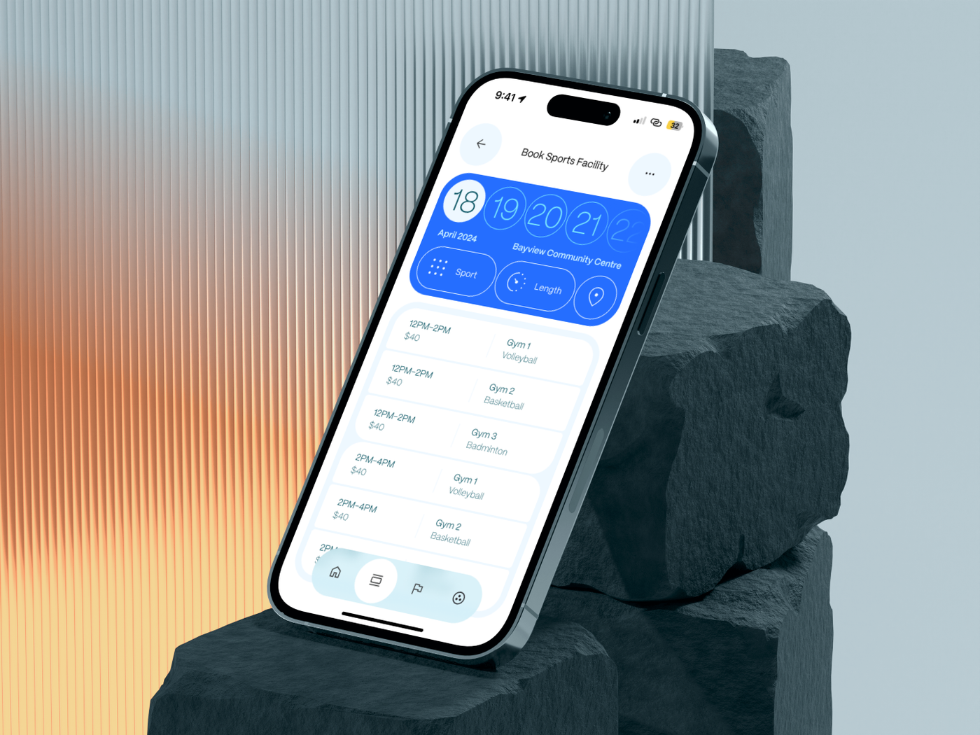
Study-room rows pair the time slot with the room name, capacity, and amenity icons. The sports version uses the same structure to show the gym, sport, time, and price. Keeping these details together supports comparison within one view. Capacity and length controls help narrow study-room choices, while sport and length controls suit the facility flow.
Before confirming, a focused review screen collects the selected date, time, and room or court. Photos and amenity information add context to the reservation. A swipe action marks the final commitment, and a separate success state closes the flow. The account concept was intended to carry resident information between tasks, reducing the need to enter the same details for each booking.
Service requests
Explain the service before asking for information
The service area starts with recognizable categories such as large-item pickup, streetlight maintenance, and plants and vegetation. Each is a direct entry point into a particular request. The interface identifies the service provider so residents have context for the task they are about to complete.
For large-item pickup, the design places the date selection alongside an explanation of eligibility. Accepted and unacceptable materials are listed before the request form. That sequence gives residents the information needed to decide whether the service applies to their situation before they spend time filling it out.
The next screen allows up to five items and then asks the resident to confirm contact and address information. Separating service rules, item details, and personal information gives the request a readable progression. Together, these screens carry a request through a series of focused decisions within the Figma prototype.
Community
Connect local information with a clear next action
Community updates groups polls, notices, and local projects into distinct sections. Road construction and transit changes can be read as notices, while a project or poll leads into more detail. This gives informational browsing and active participation a place within the same area without treating every item as the same kind of content.
A poll screen presents the initiative before asking for a Yes or No response. The design includes copy describing polls as anonymous. We wanted the action and its expectations to be visible at the point of participation. Keeping that explanation close to the response controls gives the resident context before submitting an opinion.
Onboarding uses the same approach to context. It explains why an address is requested and introduces the account setup in steps, including the proposed flyer-code verification. These screens frame an account around the services it would enable, while keeping each stage of data entry focused.
Outcome
Turn a broad idea into a coherent prototype
We completed the high-fidelity screens and an interactive Figma prototype, then presented YRConnect to the judges. The prototype let us demonstrate the relationship between home, facility booking, service requests, and community participation. We explained how the visual system and recurring patterns supported the different tasks within one resident experience.
YRConnect won Second Place overall at YRHacks 2024. It was a rewarding end to my third hackathon, where our submission centred on interface design and a connected product concept. The final presentation brought our prototype and the reasoning behind its decisions together.
My main takeaway was the value of setting a clear direction early. Planning the feature set, dividing responsibilities, and building reusable components helped us carry the idea through to the presentation. The work also reinforced that a prototype and a concise explanation of the design decisions are both part of making a product proposal understandable.