Newly
Newly turns a conversation into a real iOS, Android or web app. I design the product: the desktop and web workspace where you describe what you want, watch the agent build it, test it on a simulator and ship it to the App Store.
Newly
Product Design
2026
Visit ↗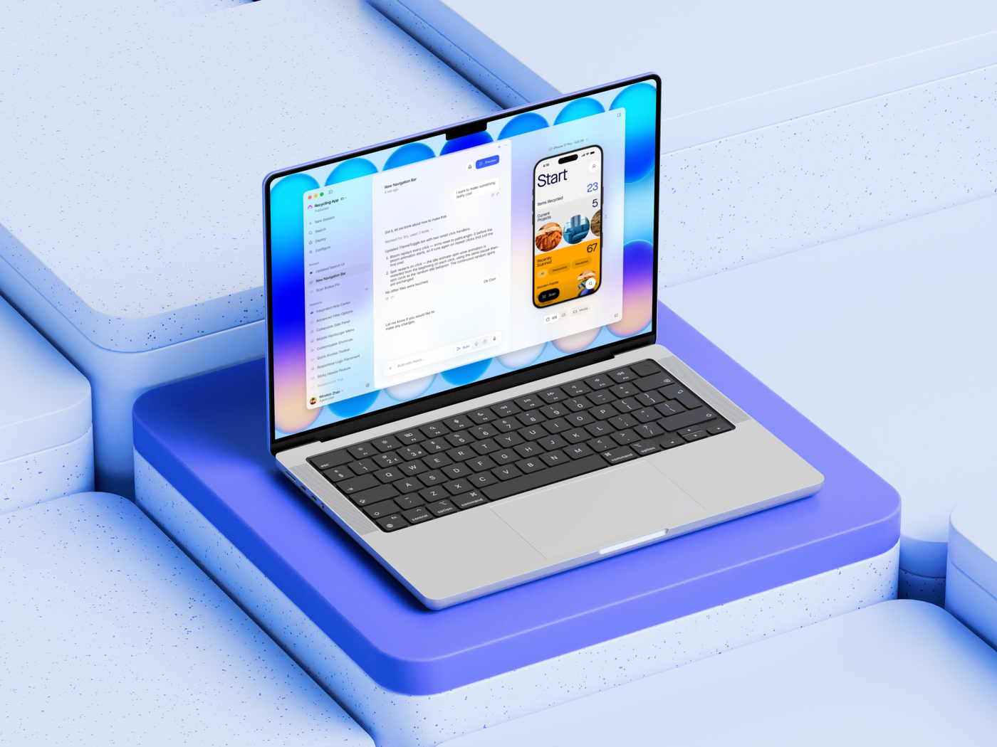
Building an app should feel like a conversation. So the prompt bar is the product, and everything else is arranged around it.
- Role
- Product Designer
- Timeline
- May – October 2026
- Platform
- macOS · Web
- Scope
- Workspace · Prompt bar · Device preview Deploy · Launcher · Marketing
- Tools
- Figma
Overview
Newly is an AI agent that builds mobile apps from a chat. When I joined, the agent could already build; the product around it was mostly a blank window. Over five months I designed the desktop and web workspace — launcher, sessions sidebar, conversation, live device preview and the deploy flow — along with the one component every surface shares: the prompt bar. The work spans two generations of information architecture, a long tail of component states, and many small decisions about how an agent should show its work.
Impact
A complete desktop and web workspace, from launcher to App Store release, built around a single prompt-bar component and one set of layout rules.
Context
An agent that builds apps needed a place to work.
Newly’s agent writes, runs and ships mobile apps from natural language. That is a lot of machinery to put behind a text box: sessions that run locally or in the cloud, a simulator, git branches, model choices, deployment to TestFlight and the App Store. The design problem was deciding what a person needs to see, and when — and keeping the rest one click away.
I joined as the designer on a small team. The constraints were real: desktop and web had to feel like one product, the audience included people who had never opened Xcode, and the agent’s work had to be visible without turning the chat into a terminal.
Explorations
Should the home be a board or a chat?
My first direction treated the app like a product roadmap. The agent proposed features as cards — “Proposed by Newly”, with a reasoning panel citing session data and drop-off rates — and you approved, built and deployed them from a board. I pushed it far: a git-style tree of sub-features, a “New Idea” card you could compose inline, and three columns for Features, Marketing and Website.
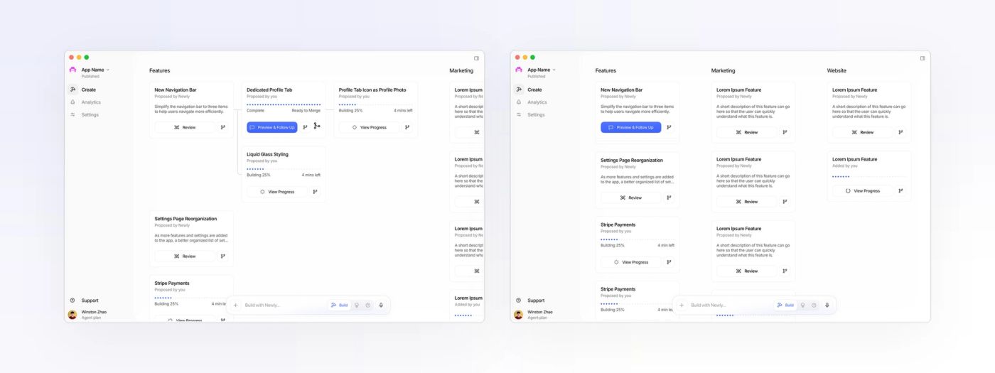
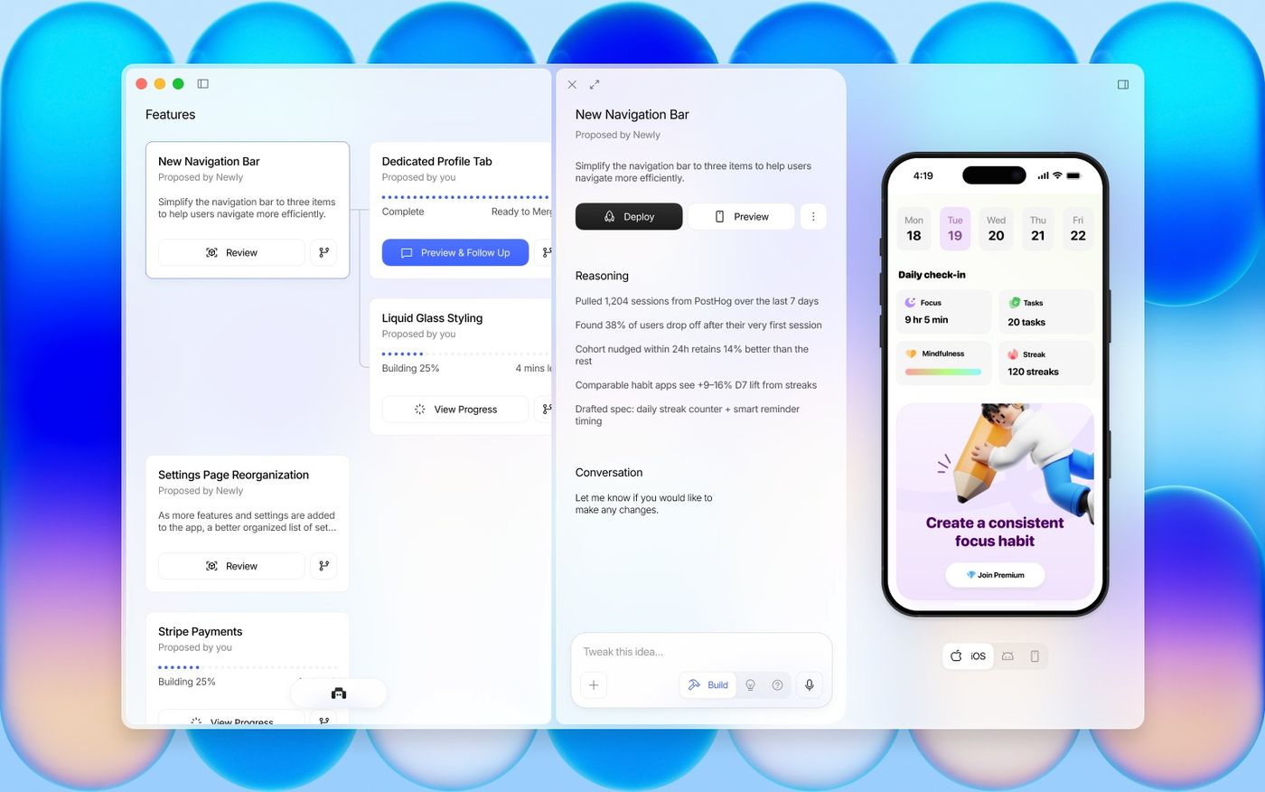
It demoed well, and it was wrong. People didn’t want to manage a roadmap; they wanted to say what they wanted and watch it appear. The board’s best ideas — provenance, progress, reasoning before you approve — survived inside a chat-first workspace.
Workspace
Three columns that collapse to one.
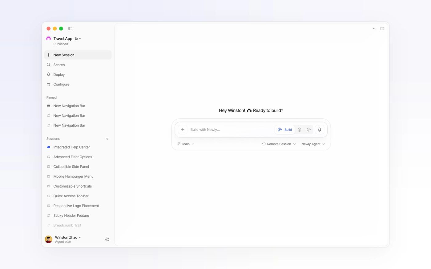
The workspace is a sessions sidebar, a conversation and a device preview — each a rounded card that can collapse on its own. Pinned and recent sessions sit on the left with a cloud or laptop glyph for where they run and a blue dot for the one that is running; the conversation stays in the middle; the simulator takes the right.
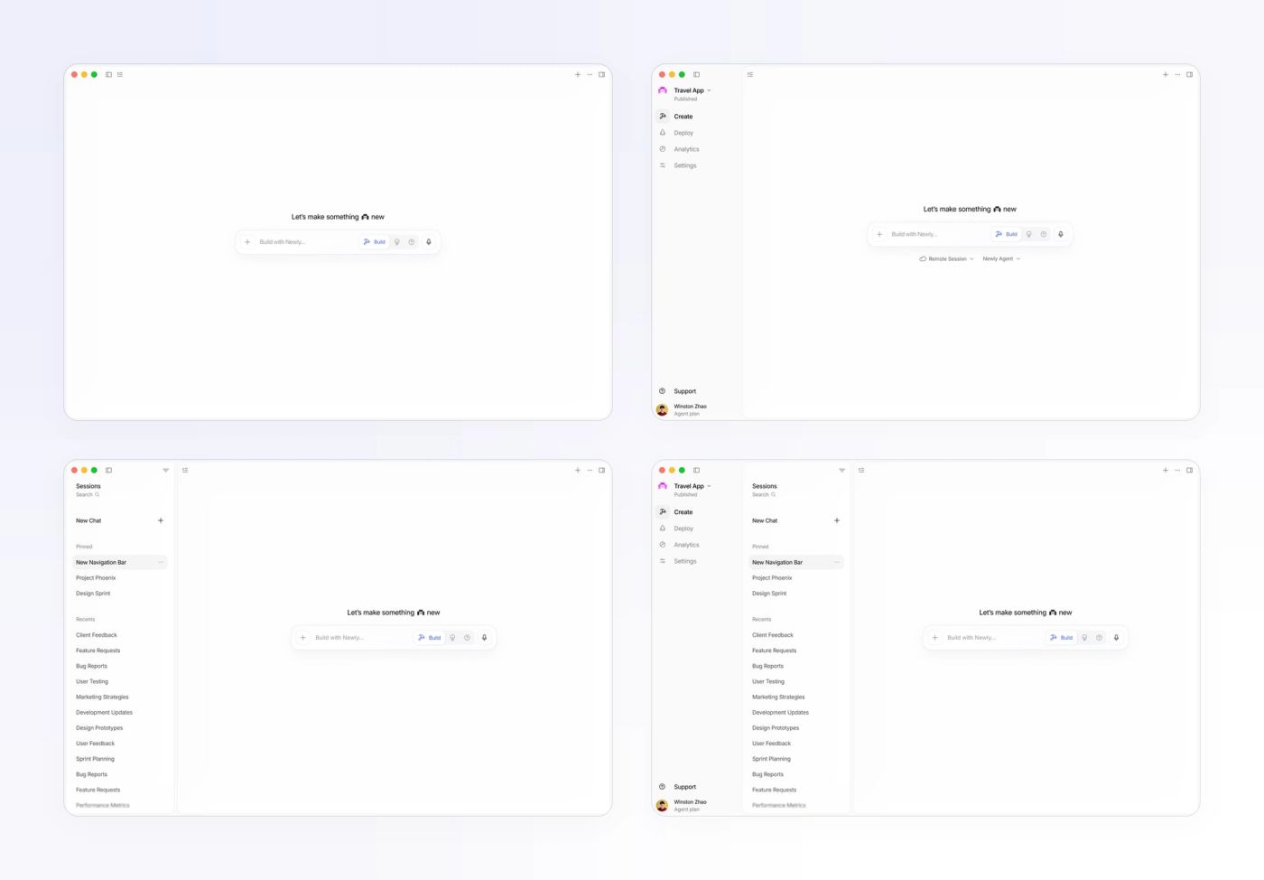
I rebuilt the sidebar once along the way: Create / Deploy / Analytics / Settings became New Session / Search / Deploy / Configure, because people think in sessions, not in product areas.
The prompt bar
One bar, three modes, every state.
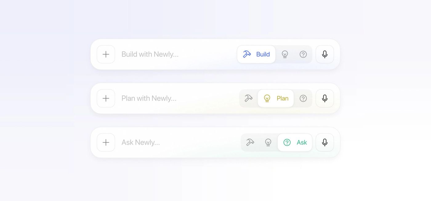
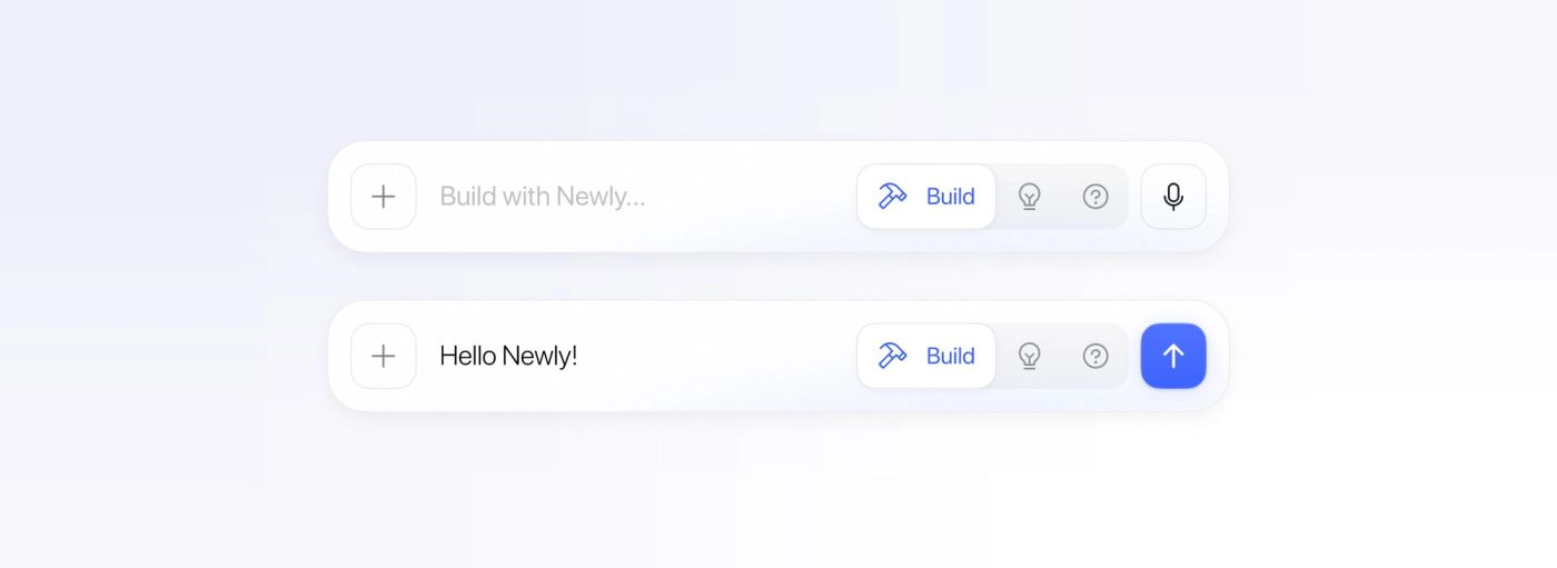
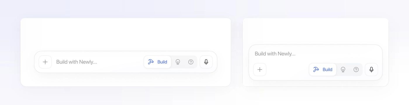
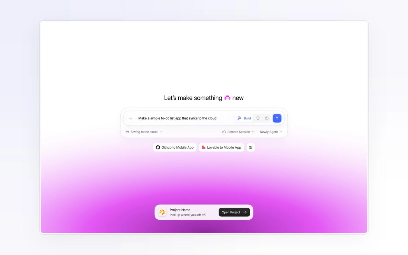
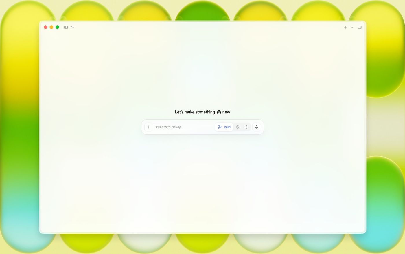
The prompt bar is the one element on every screen, so it got the most attention. It has three modes — Build, Plan and Ask — in a segmented control where only the active mode shows its label, so the bar stays narrow but always says what it will do. Attach on the left, microphone or send on the right, and a second row for the things you set once: where the session runs, which branch, which model.
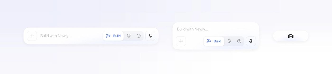
It comes in three layouts for three widths: expanded on the empty canvas, stacked when the column is narrow — placeholder on top, controls below — and collapsed to the Newly mark when a panel needs the room.
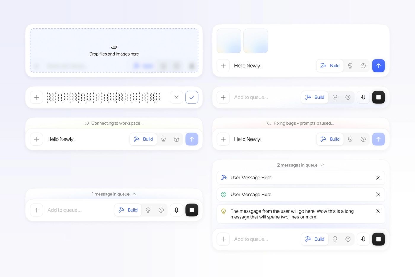
Then the states that make an agent feel alive: dropping files, attached images, a voice message, a stop button while it works, a status line while it connects or fixes a bug, and a queue — you can keep typing while it is busy, and your messages wait in order above the bar.
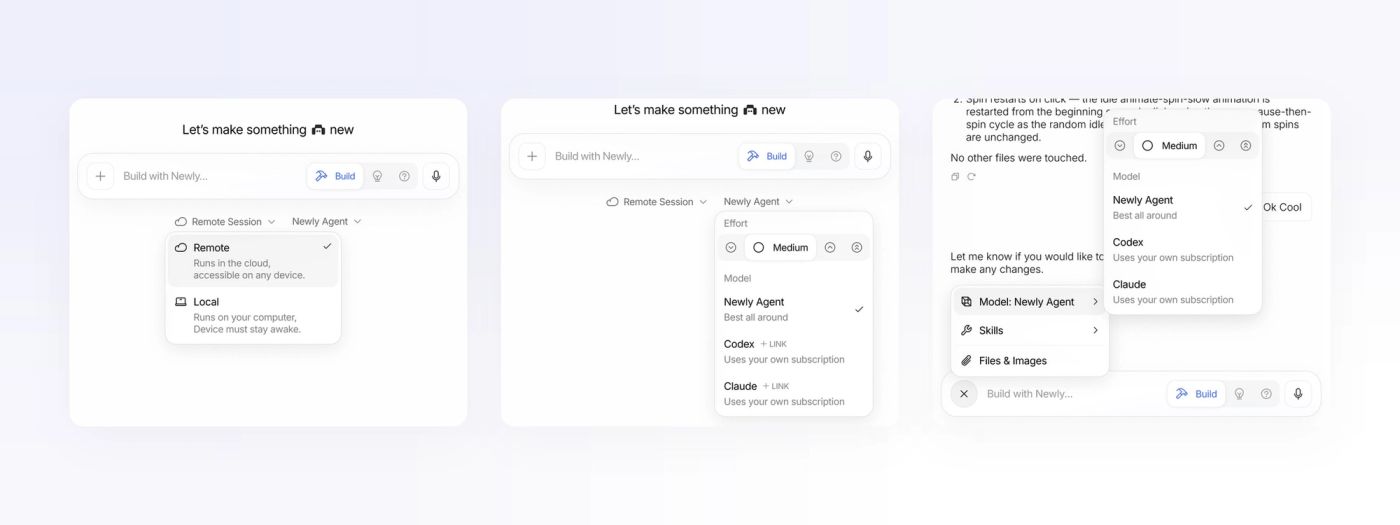
Settings follow progressive disclosure. On the empty canvas, Remote Session and Newly Agent sit under the bar and open into popovers that explain the trade-off in one line — “Runs in the cloud, accessible on any device” against “Runs on your computer, device must stay awake”; Effort as a scale, Model as a list with “+ LINK” for your own Codex or Claude subscription. Once a conversation starts, the same popovers move behind the + button.
Conversation & preview
Chat on the left, the app on the right.
The conversation is deliberately plain: your messages in bubbles, the agent’s as text, and its work folded behind one line — “Worked for 3m, used 3 tools” — that expands to the commands it ran. The device pane starts as an explanation and a Run button, then becomes a live iPhone 17 Pro with a rail of simulator controls beside it.
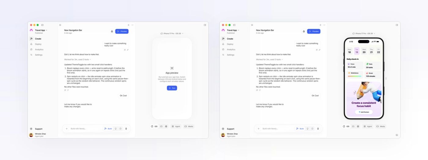
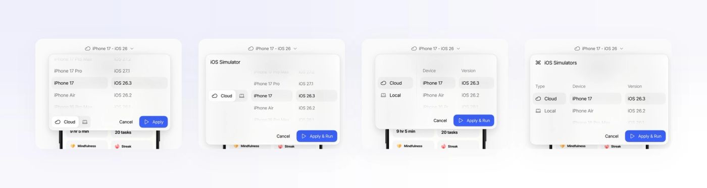
Choosing a simulator sounds trivial and took eight iterations: the cloud/local toggle moved from the footer into its own column, the columns got labels, the wheel picker became a list, and “Apply” became “Apply & Run” so the consequence was explicit.
Deploy
From a session to the App Store.
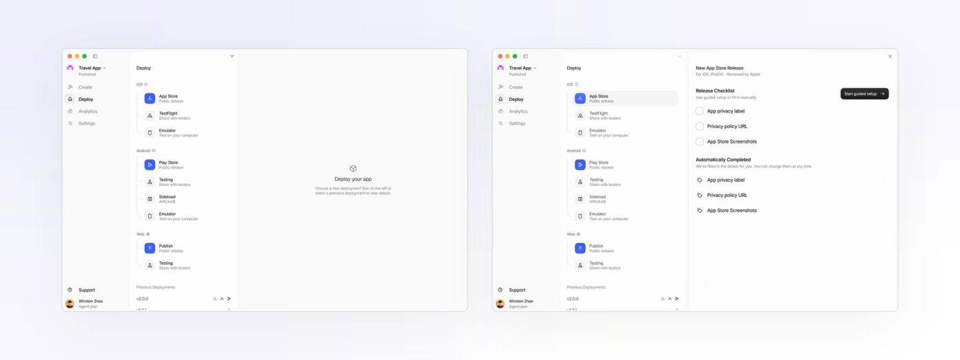
Deploy groups destinations by platform — iOS, Android, Web — with the public release in blue and testing targets in grey. Pick the App Store and a release card slides in with a short checklist and, underneath, what the agent already filled in. The point was to make the agent’s busywork legible, not invisible.
Launcher & web
Native on the desktop, familiar on the web.
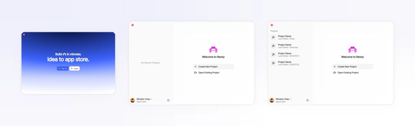
The desktop app opens like an IDE: a sign-in splash, then a small welcome window with recent projects. On the web the same workspace runs in the browser, with a brand gradient and a “Pick up where you left off” toast. The two differ only where the platform does — traffic lights here, a download nudge there.
Visual system
Blue means go; pink stays in the logo.
The interface is nearly colourless on purpose: an off-white window, white cards with hairlines, one typeface, Phosphor icons. Blue is reserved for the active mode, the primary action and anything that is running. The brand’s pink and the gradient wallpapers stay in the logo, the launcher and marketing, so the user’s own app is the most colourful thing on screen.
Reflection
What designing for an agent taught me.
Most of the work was states, not screens: what the bar says while the agent connects, fixes a bug, or holds your next three messages. Designing those honestly — a status line, a queue, a stop button — did more for trust than any onboarding could.
I also learned to kill a direction I liked. The feature board was the most “designed” thing in the file, and the right call was to keep three ideas from it and let the rest go.