Yelo App
Yelo is a campus ride-share for students, built by a founding team recognized on Forbes 30 Under 30. As the product designer I designed the rider app from a blank file: onboarding, home, search, map, ride selection, events, deals and profile.
Yelo
Product Design
2026
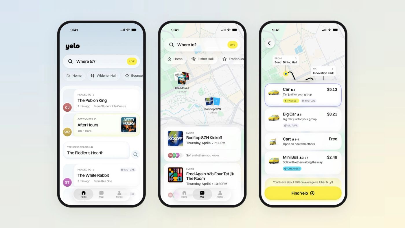
Students don’t just need a ride — they need to know where everyone is going. So the app starts with the destination, and every destination ends in a ride.
- Role
- Product Designer
- Timeline
- January – April 2026
- Platform
- iOS
- Scope
- Rider app · 60+ screens Onboarding to ride request
- Tools
- Figma · 3D renders
Overview
Yelo runs one campus at a time, where the same few hundred people move between the same libraries, residences, bars and events, in a fleet of yellow cars, carts and mini buses priced below the big apps. The founders had the fleet and the pricing; they needed a rider app that felt like campus rather than a transaction. I owned the rider experience end to end — from the first sketches to a build-ready Figma file — working directly with the founding team.
Impact
A complete rider app from sign-up to ride request, with a reusable component set and a 3D vehicle fleet the team can keep building on.
Context
A ride-share for one campus at a time.
Yelo is a student-only ride-share. Verified students ride in a fleet of yellow cars, carts and mini buses, and most trips go to the same handful of places: the library, a residence, a kickoff party. Uber and Lyft treat a trip as a transaction. On campus, the trip is social.
My brief was open: design the rider app. I had the brand colour, the fleet and the founders’ thesis. Everything else — information architecture, flows, components — was mine to figure out.
Home screen
Thirty versions of “Where to?”
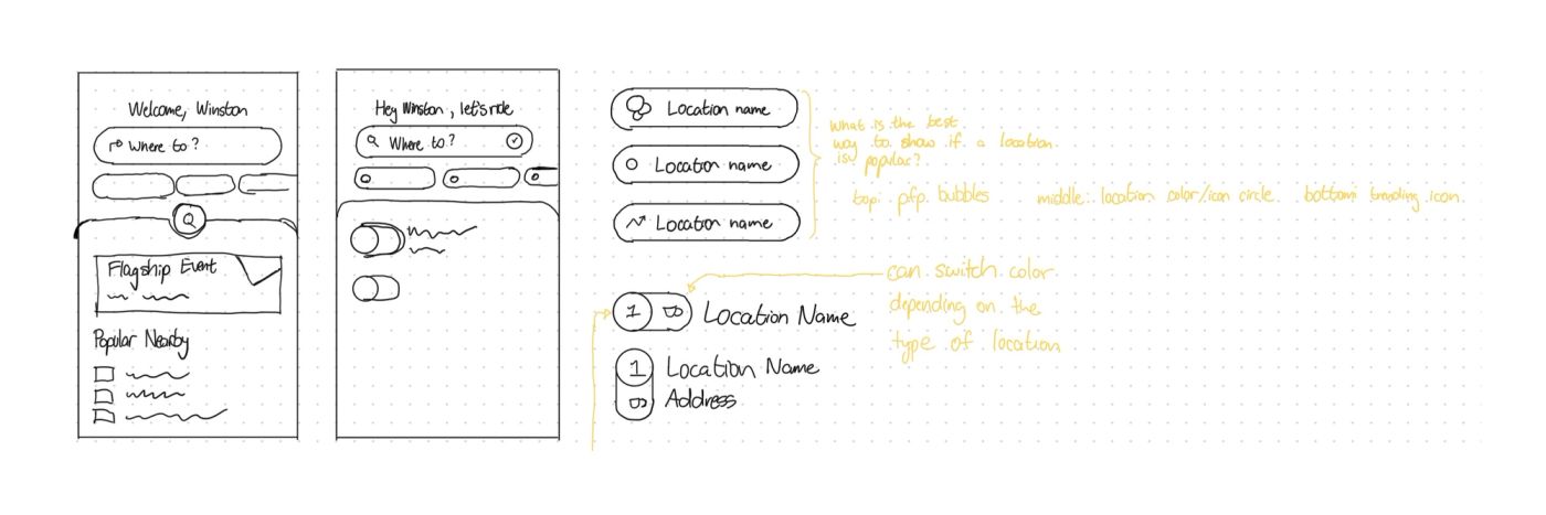
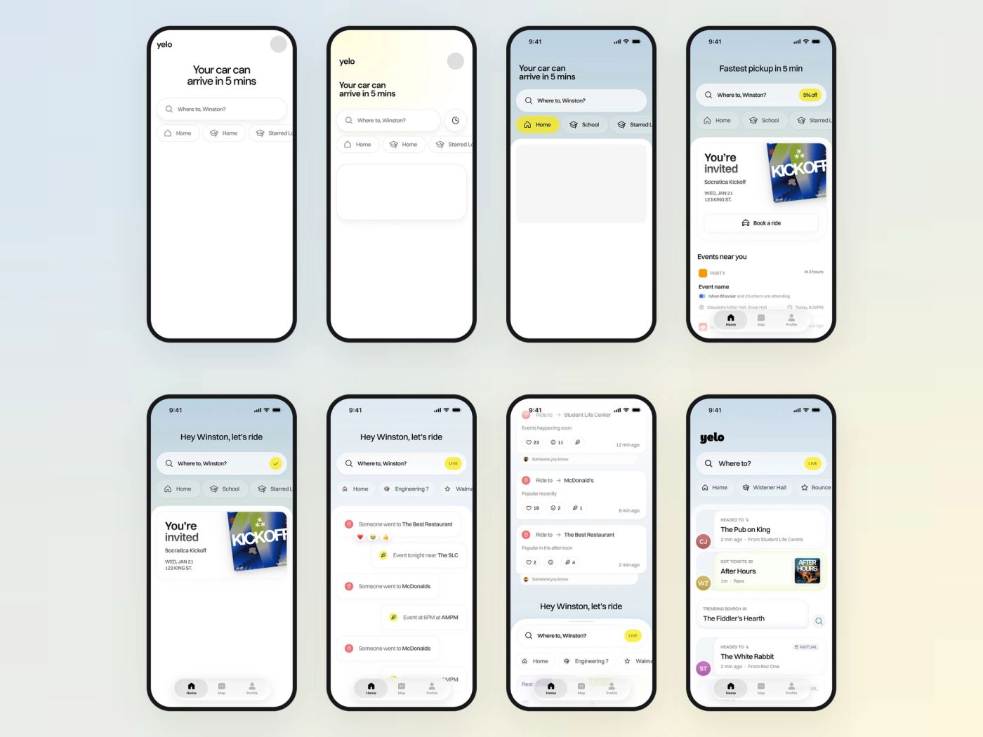
The home screen carries the whole thesis, so I iterated on it more than anything else — over thirty versions on a single row of the canvas. It started as a search box with a greeting. Then came a sky gradient and a white sheet, events near you, an invitation card with a “Book a ride” button, and finally a live feed of where people are heading.
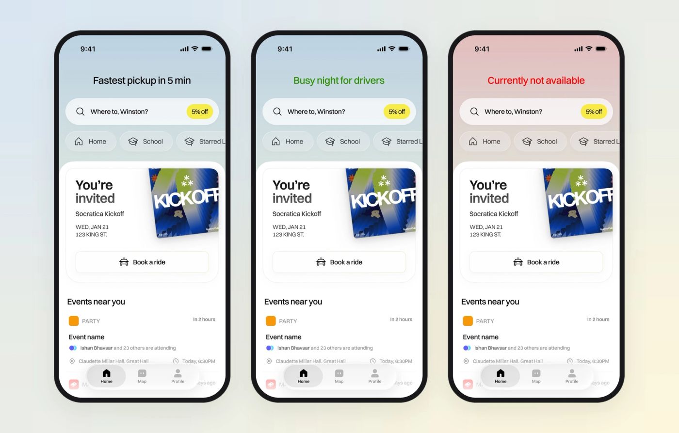
Along the way I tried using the headline as live system status — “Busy night for drivers” in green, “Currently not available” in red, with the sky tinted to match — so the app could tell you how the night was going before you typed anything.
Four directions
Feed first, search first, chat, or a list?
Once the content was clear, I framed four labelled directions and reviewed them with the founders. A put the social feed on top with search in a bottom sheet. B kept search first with social cards underneath. C turned the feed into chat bubbles with reactions. D ranked popular places as a list.
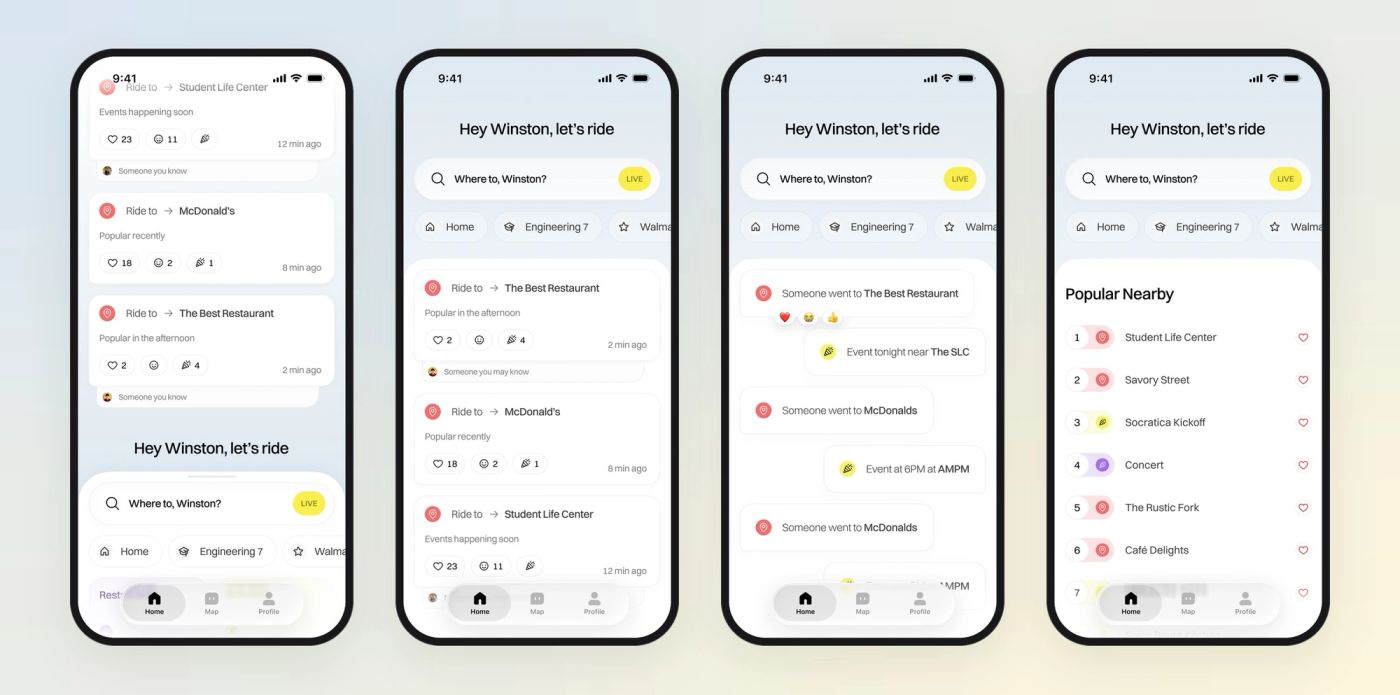
B won. Searching for a ride stays the primary job and lives where thumbs expect it, while the cards underneath add context — who is heading where, and whether you know them — without turning a ride app into a messaging app.
The feed card
A card that says who, where and why.
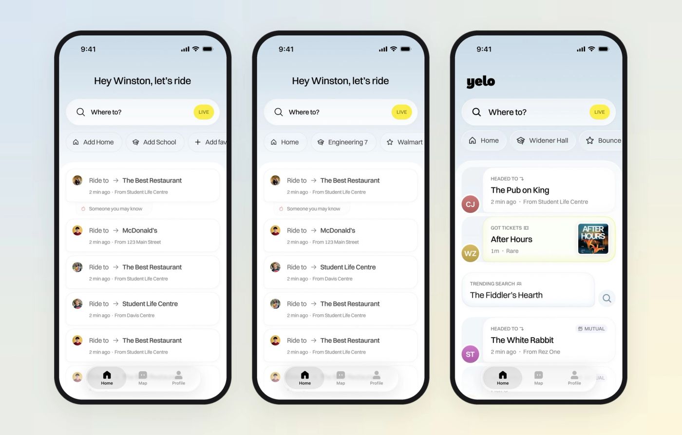
The feed card went through the most refinement. Early versions read like notifications. The final card moves the person’s avatar outside the card, adds a small-caps label for the kind of signal — HEADED TO, GOT TICKETS, TRENDING SEARCH — then a bold destination and a quiet line for time and origin. A MUTUAL tag marks friends of friends.
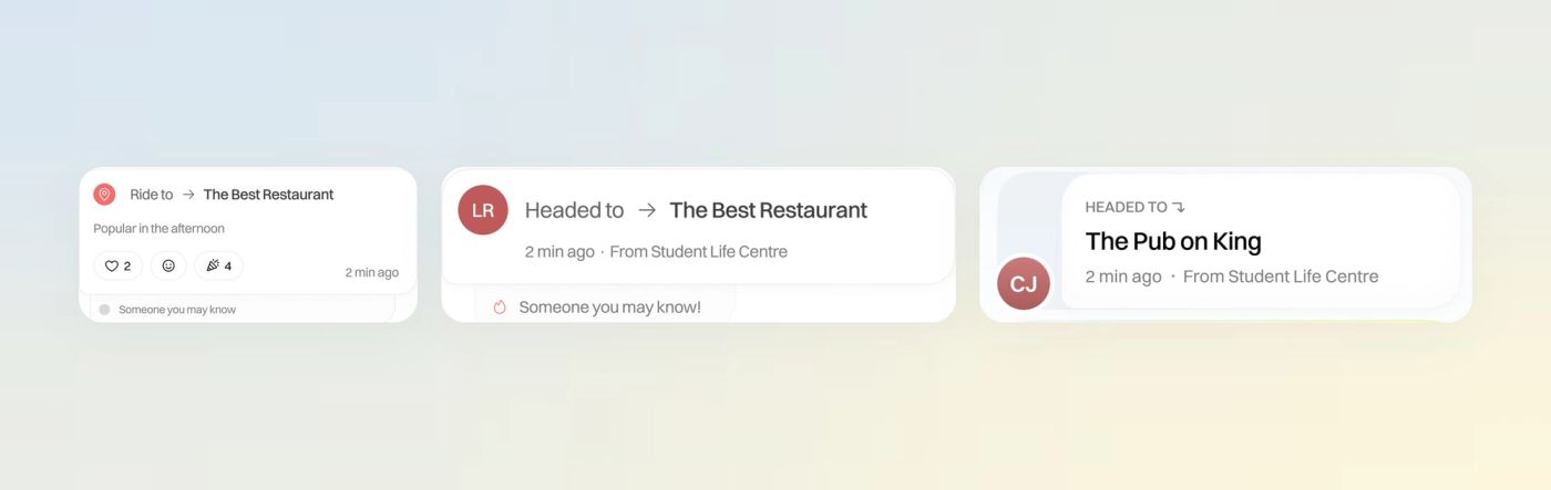
The same structure handles first-run and returning users. Before you have saved places, the chips read “Add Home” and “Add School”; afterwards they are your shortcuts.
Search & map
From “Where to?” to a route in two taps.
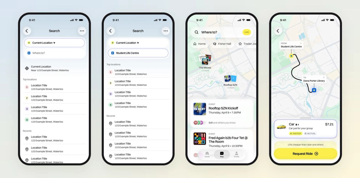
Search stacks “Current Location” and “Where to?” as two coloured dots, with top locations ranked and recents below. The map keeps your saved places as chips and clusters tonight’s events as poster stacks over the campus. Pick a destination and the route draws itself, with the ride sheet already open.
Choosing a ride
Vehicle classes you can picture.
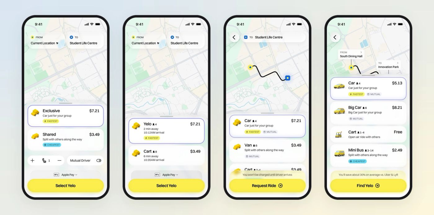
The ride sheet started as Exclusive vs. Shared with a seat stepper, moved to an ETA-first list, and settled on named classes — Car, Big Car, Cart, Mini Bus — each with capacity, price and one tag: FASTEST, CHEAPEST, MUTUAL or UW DRIVER. Above the yellow button sits a single line of reassurance: when you’ll be charged, or how much you’re saving.
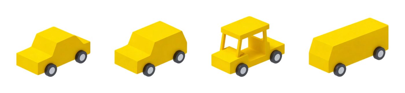
To make the classes legible at a glance I built a 3D fleet in Yelo yellow, plus a low-poly toy set for empty states and marketing.

Events & deals
Every event page ends in a ride.
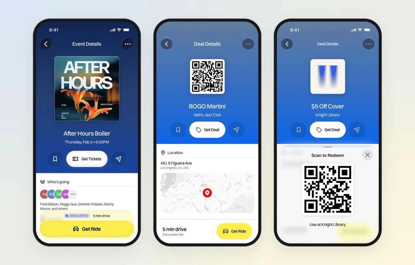
Events and deals are what make the feed worth opening. An event page shows the poster, who’s going and the venue on a map; a deal shows the offer and a QR code to redeem. Both end in the same footer — “5 min drive · Discounted Yelo · Get Ride” — so the app never forgets what it’s for.
Onboarding
Prove you’re a student in three screens.
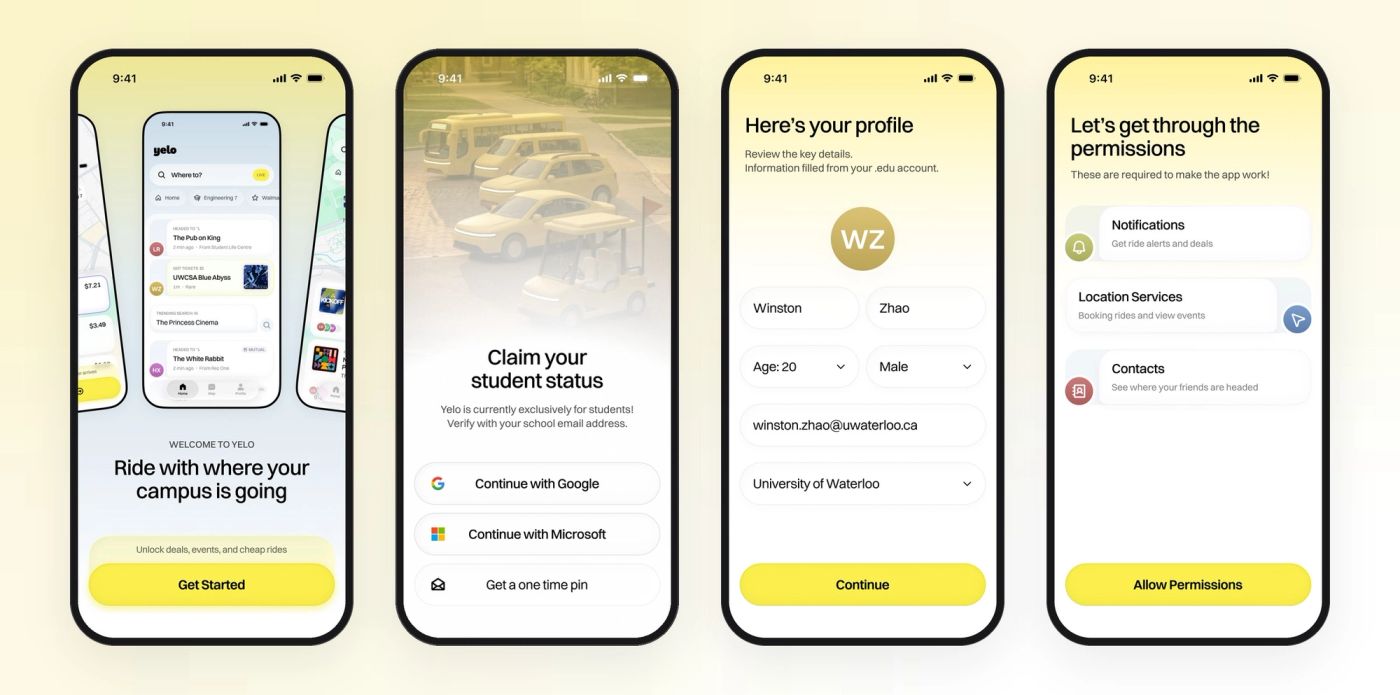
Yelo is students-only, so onboarding has to verify a school account without feeling like paperwork. Phone number, a one-time code, then “Claim your student status” with Google or Microsoft sign-in. The profile is pre-filled from the .edu account, and permissions are asked for with the reason each one is needed.
Visual system
Yellow means one thing.
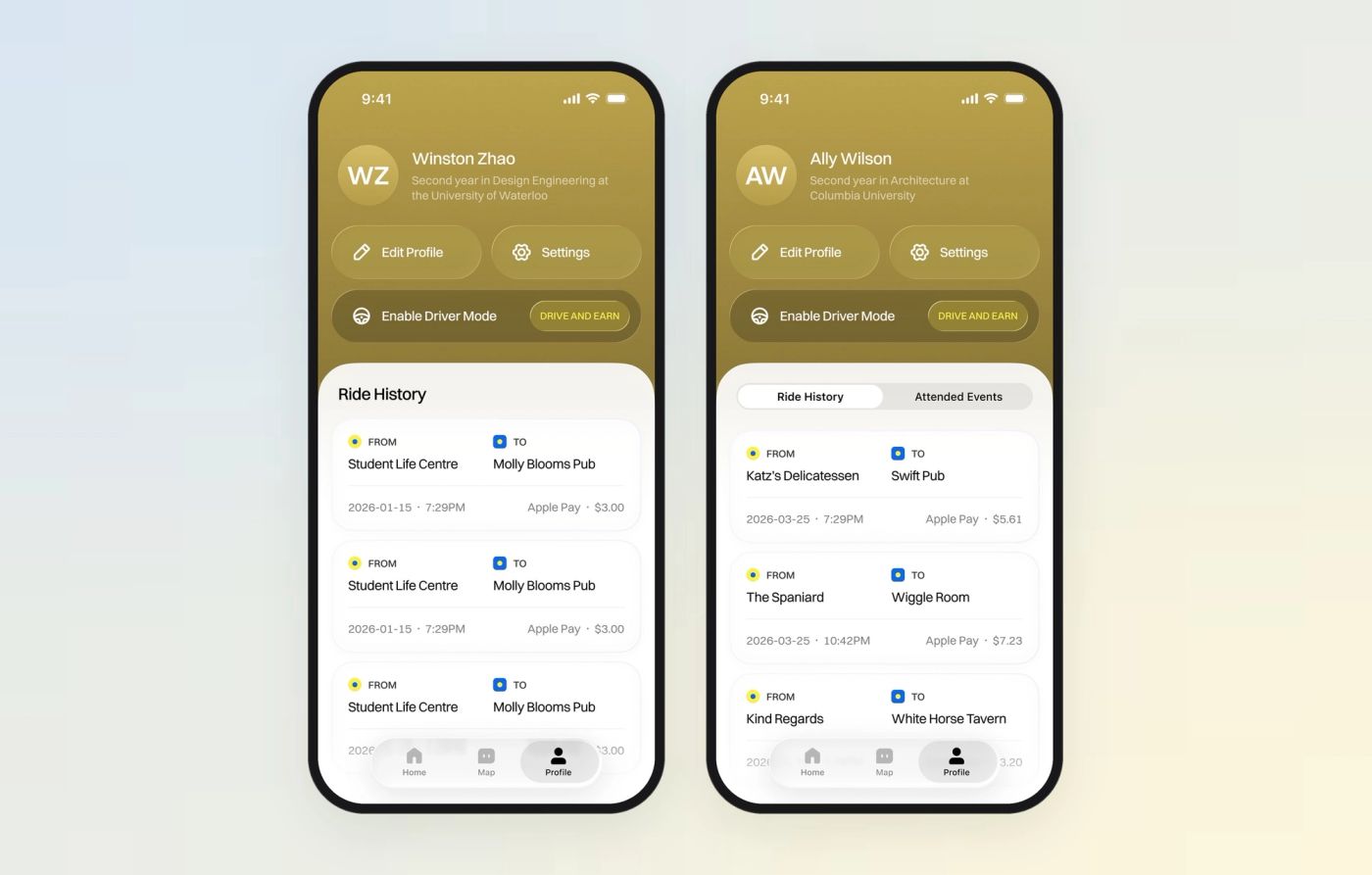
Yellow is reserved for the live signal and the primary action — LIVE, Available, the ride button — so it never competes with event artwork. Everything else sits in neutrals on a soft sky gradient: a floating Home / Map / Profile bar, large rounded sheets, one typeface. Avatars are coloured initials, so the feed works before anyone uploads a photo.
Reflection
What I’d carry into the next project.
Designing from a blank file taught me to put the thesis on the screen early and iterate in the open: thirty home screens on one row made the trade-offs visible to the founders in a way a deck never could. Naming four directions got us to a decision in one review. Building the 3D fleet myself turned a pricing table into something students could picture.
Next, I’d prototype the live feed with real campus data to see how often it surfaces something worth tapping, and put the ride sheet in front of drivers as well as riders.